Aveeno Daily Moisturizing Face Lotion: A Packaging Design Analysis
A deep dive into what makes this skincare packaging work from a design and engineering perspective
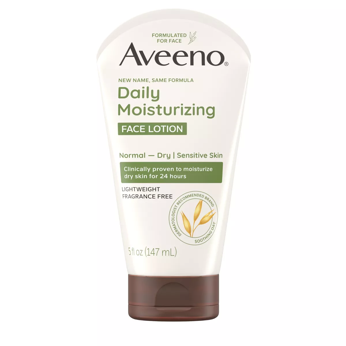
![Aveeno Face Lotion Packaging Image]
As packaging professionals, we often walk through store aisles scrutinizing the competition's latest designs. Today, I'm breaking down Aveeno's Daily Moisturizing Face Lotion packaging – a design that exemplifies how strategic decisions influence both form and function in the personal care space.
First Impressions Matter
When I first spotted this Aveeno tube on shelf, what struck me was its clean simplicity. The predominantly off-white canvas creates a sense of purity – increasingly important in today's "clean beauty" market. The earthy green accents strategically highlight key information while the brown cap anchors the design, offering a premium visual cue.
Is there anything more challenging than designing for the oversaturated facial moisturizer category? This packaging manages to stand out through restraint rather than noise.
Design Hierarchy That Guides the Eye
What's particularly effective about this design is its clear visual hierarchy:
- The prominent Aveeno wordmark establishes brand recognition instantly
- "Daily Moisturizing" communicates the core benefit
- "FACE LOTION" in that distinctive green panel ensures category recognition
- Supporting claims follow in descending order of importance
This thoughtful organization creates an intuitive information flow that respects how consumers actually shop – often making decisions in seconds.
Functional Brilliance in Tube Design
Beyond aesthetics, this packaging solution solves several practical challenges:
- Stability: The flat-bottom tube stands firmly upright, maximizing shelf presence
- Dispensing control: The tube format allows precise product application
- Product protection: Limited opening size minimizes air exposure
- Usage efficiency: The inverted design ensures maximum product evacuation
The brown flip-cap deserves special attention – it provides one-handed functionality while creating visual contrast. It's a small detail that enhances both the user experience and brand recognition.
Communication Strategy
Aveeno's messaging strategy on this package is worth noting:
- "NEW NAME, SAME FORMULA" addresses potential consumer anxiety during rebranding
- The "clinically proven" claim in its highlighted panel adds scientific credibility
- "LIGHTWEIGHT FRAGRANCE FREE" speaks to specific consumer preferences
- "Normal — Dry | Sensitive Skin" clearly identifies the target user
What's missing? Perhaps intentionally, there's no overwhelming list of ingredients or benefits – just focused messaging that respects the consumer's intelligence.
Manufacturing Considerations
From a production standpoint, several smart choices are evident:
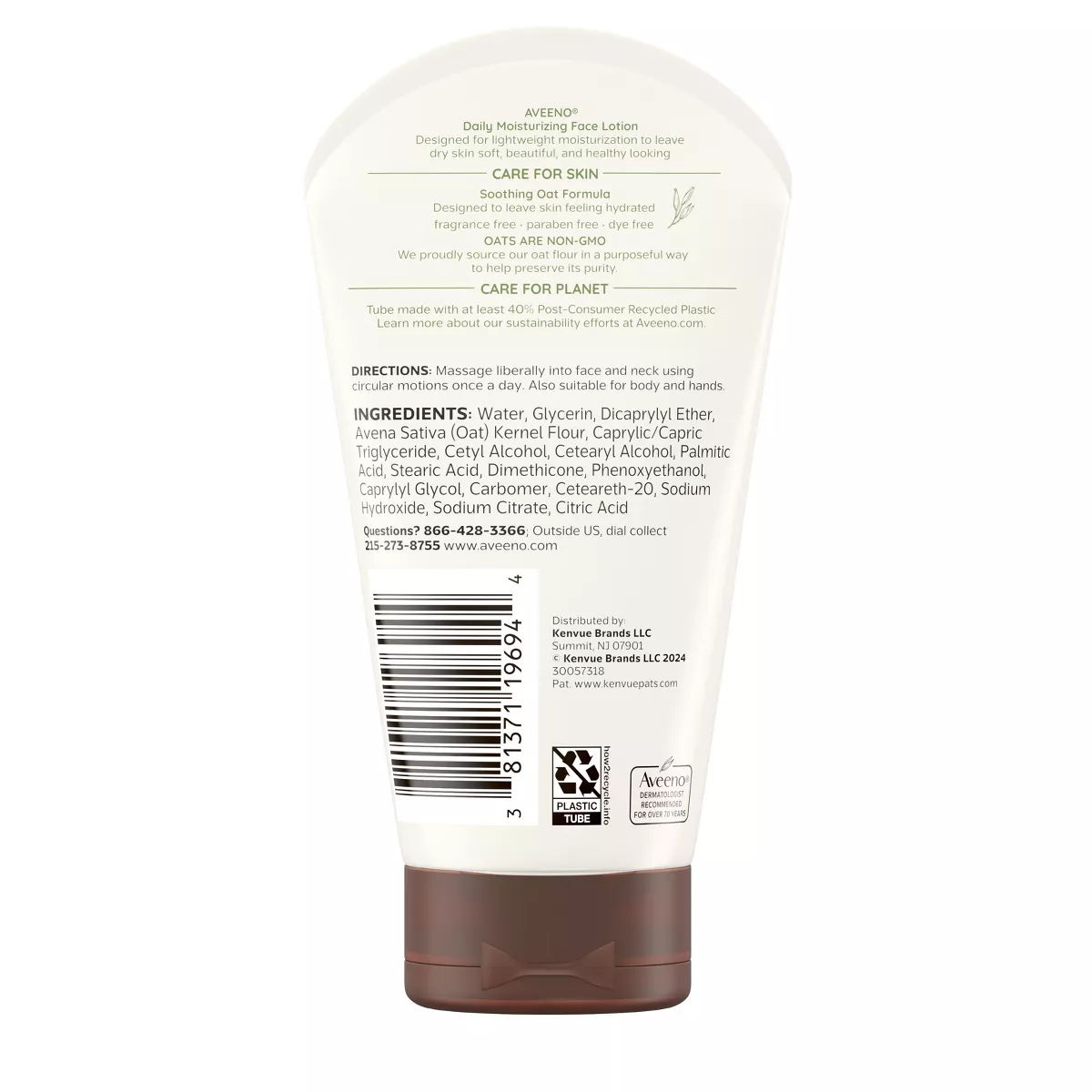
- Direct printing on the tube substrate (likely avoiding costly labels)
- Use of spot colors rather than process printing
- Matte finish that elevates perceived value
The material selection balances cost considerations with functionality – presumably polyethylene for the tube body with a more rigid polypropylene cap structure.
Where This Design Could Go Next
For brand managers and packaging engineers looking at this design as a benchmark, several opportunities for evolution exist:
- Sustainability story: Adding recycling information or sustainable sourcing claims would address growing consumer expectations
- Sensory elements: Introducing tactile features could further differentiate the premium positioning
- Digital integration: A QR code could connect physical packaging to digital experiences
- Supply chain efficiency: Minor shape adjustments could potentially optimize case packing
The Takeaway
What makes this Aveeno packaging successful is not any single revolutionary element, but rather the harmonious integration of brand identity, functional requirements, and consumer communication. It's a masterclass in restraint – knowing what to emphasize and what to minimize.
For our packaging teams, this case reminds us that effective design isn't about cramming in features or claims, but about creating a cohesive system that serves both brand and consumer needs simultaneously.
What packaging designs have caught your eye lately? Share your thoughts in the comments below!
About the Author: [Your Name] is a packaging development specialist with over 15 years of experience in consumer packaged goods. Connect on LinkedIn for more packaging insights and analysis.